The Statue of David may be replaced by “COS”
By Johannes Werner
Original Air Date: Feb. 14, 2024

Host: Could the City of Sarasota’s new brand be “COS”? COS or not, one thing is sure: The curvy “S” is out. And maybe even naked David could be history. In a workshop on Monday, City of Sarasota commissioners gave the city’s marketing chief feedback on new logo proposals. Our news team watched.
Johannes Werner: The City of Sarasota commission is not yet at the point of giving direction about the new logo. But as Marketing and Outreach Coordinator Ciera Coleman presented an array of proposals, her elected bosses’ feedback seemed to point to where this may be going: The shiny, expensive looking “City of Sarasota” sign with the curvy “S” and silhouette of naked David on the wall of the commission chambers behind them could soon be history.
The City of Sarasota is into remaking its logo, and that could possibly bring about a complete – and quite expensive – rebranding effort.

The city first asked residents in a survey about their preferences, and 2,600 responded. Sixty-seven percent disliked, or were indifferent, to the current logo. But what do they want? It’s not simple, as Coleman explained.
Ciera Coleman: One of the questions asked was what do people think of, what comes to mind, with the city of Sarasota. And the primary choices that came out were the beaches, the bayfront, the art, and downtown.
Additionally too, going through the write-in responses, we see a lot of different things. We see nature, the modern architecture, the circus, the skyline, the bay, sunshine. And we really see that … Sarasota means a lot of different things to different people, and there’s a lot of things that hold significance here. So trying to hone in on just one thing, it’s a little challenging.

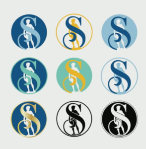
JW: The city is working with a design firm, but Coleman did actually most of the design work herself. She showed her bosses three series of options: Coleman called them “Refreshing David”, “Modernizing David” and “Something Else”.
All four commissioners who spoke up seemed to discard a first series of options that kept the curvy S, wrapping itself around David. Two of them expressed their liking of a second series of options – particularly a modernist, multicolor S next to David.
Commissioner Jen Ahearn Koch said she went into the workshop ready to fight for David. That’s not so much because she likes the copy of Michelangelo’s statue of the naked beau that stands in the patio of the Ringling Museum of Art. Rather it’s the uniqueness of the logo she wants.
Jen Ahearn Koch: You know how attached I am to the current logo. I do think it’s iconic, it’s recognizable. It’s very

different than any other city in the state of Florida. You go online and you look at all of them, and they all look the same. They all have birds, and sunsets, and palm trees, and water. They all have the same thing. There are a handful of city logos that are iconic, that stand out, that really brand that city. And that’s why — say what you want about the David — it’s ours. And it has been our symbol since the 90s. And then it’s an actual thing in our city, that’s unique to our city.
But I really appreciate what you’ve done here. I think that it’s something that we can really work with. I love the lines. I even liked when you were building up to it, when you had the geometry built into it. I like geometry. I’m very geometric. That’s why I like Sarasota School of Architecture so much. There’s stability and creativity in geometry.
JW: But after that extended comment, Ahearn seemed to be ready to drop David in favor of the “something new” option.
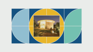
What seemed to get most positive feedback from the four commissioners who spoke was the third series of proposals: Three stylized shapes that stand for “COS” – or City of Sarasota. The “C” could come in the color teal – like the Gulf of Mexico – the “O” in an orangy yellow – as in sunsets – and the “S” in blue – like the cloudless Florida sky. The shapes could be filled with imagery such as the David statue, samples of modernist Sarasota School architecture, beaches, or circus.
Commissioner Jen Ahearn-Koch had this to say.
JAK: I’m very, very impressed, because I was really not looking forward to this discussion. [laughter]
JW: The downside of the “COS” option: This is more than a change in logo design. It would require a total brand makeover that involves many things – from webpage design to letterheads and worker shirts to street signs. Coleman described this as both a challenge and an opportunity.
CC: Now, some big challenges. Obviously, a full rebrand would be required. And with that would come the opportunity, the challenge and the opportunity to build brand recognition for this new look. It’s obviously something that, you know, it’s a story that we would need to tell, but it’s a good story to tell. And it allows a lot of opportunity for us to tell it.
JW: Stay tuned.
Reporting for WSLR News, this has been Johannes Werner.
Correction: Our broadcast and a previous version of this post incorrectly stated that the city has spent $25,000 on the logo redesign. Because much of the design was done in-house, the city has spent less than the $25,000 that have been allocated.
WSLR News aims to keep the local community informed with our 1/2 hour local news show, quarterly newspaper and social media feeds. The local news broadcast airs on Wednesdays and Fridays at 6pm.